Author Archives: mjfoster83

Cognitive Cartography: Transit Map Style

2013-01-21 10.29.16Cartographers have long had a quirky, and sometimes strange, fascination with transit maps. Since the days of Harry Beck and the first London Tube maps, an entire cartographic subculture has grown around them. No longer just limited to metropolitan transit systems, authors and map creators now use them to represent everything from river systems to rock ‘n roll.  Maps are, by definition, abstract visual representations and transit maps are no different. However, transit maps are especially notable. Very few visual graphics can communicate complex messages as quickly and efficiently, distill important features out out of an incredible amount of information with such ease, and seamlessly embed an illustrative sense of place and personality as a transit map. Perhaps most remarkable, and where in lies the fascination, is the abandonment of spatial relation and reliance almost solely on logical relation.

Transit maps are far from
what might publicly be considered a “normal” transportation map. Take the Interstate Tube Map by Cameron Booth for an example. When many think of maps, especially those used for transportation, there is an expected element of spatial accuracy, relation, and scale. One inch is equal to 100 miles… this town is directly south of this town… etc. These principles are bent, skewed, or even completely ignored in transit mapping. A transit map instead relies on points of interest and major landmarks to guide people in and around a community, and cartographers must not only have knowledge of the physical surroundings, but also intricate knowledge of their cultural subject matter.

People use these types of navigational techniques and use logical relation everyday in a process called cognitive cartography, or mental mapping. Mental maps are created in the mind of an individual and represent an individuals point-of-view perception of space within their own world. The most prominent Mental Map researcher was perhaps Kevin Lynch, an Urban Planning Professor at MIT, and the author of The Image of the City. Everyone creates Mental Maps, and they consist of the pictures in our head displaying landmarks used to navigate and way-find through everyday life. Mental maps are highly unique, but within a community there will be certain commonalities. Transit maps offer intrigue because in some ways they are the most mainstream and widely accepted example of mental mapping in the field. They expand beyond the individual, grabbing commonalities and features from many people, and can represent the collective “mental map” of a community.

Transit maps can be utilitarian, but because of the extensive use of logical relation, they have an uncanny ability to show dreams and display fantasies with ease. Of course, all maps can do this, but transit maps have the ability to do so with the stroke of a few clean, primary-colored lines. Used correctly, transit maps can be highly effective tools to describe complex concepts in a simple manner, propose large projects, or further an agenda (see some maps made of a dream United States High Speed Rail System).

US-High-Speed-Rail-System-by-FirstCultural-2013-02-03

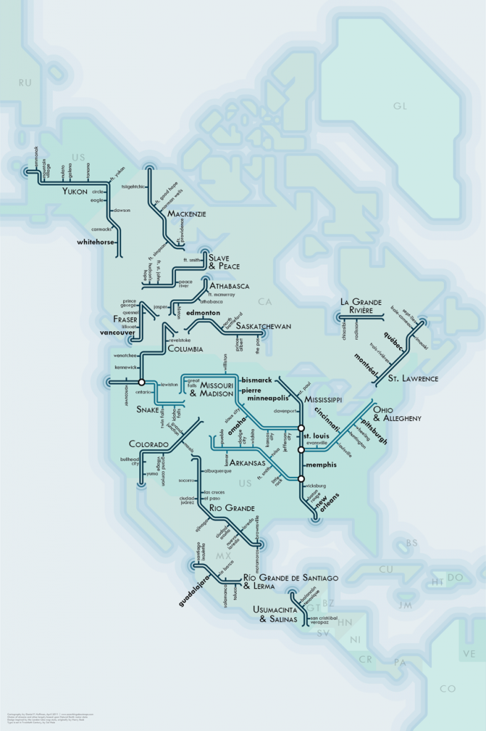
Essentially anything you can assemble into a system can be displayed in a transit map form, such as a collection of water drainage features and rivers, but you can also map the fantastic. Creative cartographers and adventurous authors have mapped everything from classic movies to internet trends to rock n roll.

AlbertoAntoniazzi_RockNRollMap_IMG2

Who knew you could listen to Aerosmith and take the Green Line to Bon Jovi?!  Happy Mapping.

-Mike


(A shoutout to the folks at Carticulate, you don’t even know the number of times I have pointed people to your color-coded skyway map.)

Hey guy, that’s my island!

In an attempt to answer a somewhat random trivia question on National Parks the other day I found a book I received a few years ago. Flipping through, it’s a National Geographic coffee table book on America’s National Parks, and is chock full of amazing pictures and maps. My roommate and I were perusing and happened to stumble across these two curious and remote islands deep in Voyageurs National Park, located on the U.S./Canada border.

Mine and Yours

Many authors, academics, and cartographers have written about the idiosyncrasies and quirks in our maps, and even more have written about place names, geopolitics and their associated controversy, notably Mark Monmonier’s book “Drawing the Line: Tales of Maps and Cartocontroversy“, or Miles Harvey’s “The Island of Lost Maps – A True Story of Cartographic Crime“. Place naming and map design give cartographers immense power in defining place, and those designs and place names have fantastic story telling power and an incredible way of telling the history and character of a region.

What happened here?  Why are these islands named this way?  My Island is in the United States, Your Island is in Canada. Were two early voyageurs on this lake, one American and one Canadian (probably both French), standing on each island yelling and claiming things?  The American was clearly dictating right?  That’s why his island became “My Island” and the other became “Your Island”.  But this is an American publication, right?  What does this say about the time?  Or the broader culture?

Maps take you on journeys without ever leaving your desk, office, bedroom, or couch. Much like music, actually.  I find this to be incredibly well stated by Miles Harvey and the following specific excerpt from his book, “The Island of Lost Maps”.

“A map has no vocabulary, no lexicon of precise meanings. It communicates in lines, hues, tones, coded symbols, and empty space, much like music. Nor does a map has its own voice. It is many-tongued, a chorus reciting centuries of accumulated knowledge in echoed chants. A map provides no answers. It only suggests where to look: discover this, reexamine that, put one thing in relation to another, orient yourself, begin here… Sometimes a map speaks in terms of physical geography, but just as often it muses on the jagged terrain of the heart, the distant vistas of memory, or the fantastic landscapes of dreams.

I use a map to get from one place to another in my mind in the same way that someone else might use it get from Omaha to Oskaloosa. It’s a peculiar kind of travel, I admit, but I suspect many others embark on similar journeys”

-Miles Harvey, “The Island of Lost Maps”

What journeys have you gone on?  Happy 2013!

Why Apple Maps is a Good Thing (and you should use it)

ScreenshotIn recent weeks, a lot has been said about Apple Inc.’s leap into the mapping world.  In an effort to free itself from a rocky reliance on a primary competitor, Apple decided to create its own mapping and navigation application.  Smart move, one might think, integrate a proprietary mapping application to complement its robust operating system, that would be great.  However, it didn’t work (… yet).  Negative reviews, generally citing a lack of substance and utility, have been scathing, and shockingly mainstream.  The underlying network and database have years of development and construction ahead of them.  Stadiums, theaters, and even entire islands, are out of location, or completely omitted.  Uncharacteristically, Apple publicly apologized, promoted use of other applications, and has even let go of designers and programmers. Kind of a mess, but this mess exposes a couple of important things, especially important to the mapping industry.  And with that, I am offering a rare positive review of Apple Maps, from a different perspective.

Four Reasons Apple Maps is Good:

1. Our societal dependence on maps is exposed.

The release of the application, followed by the magnitude of outcry, exposes our societal reliance on mapping applications in 2012.  Consumers have become so used to mapping applications (Google, Mapquest, Bing, etc.) giving them directions and information with extremely high accuracy that when this capability is reduced, it becomes stunningly disabling to complete some of the most simple things we take for granted.  A mapping application can’t find me a freeway exit with a McDonalds?   The bar I’m going to for Happy Hour is a block away in the wrong place?  These are things we take for granted in 2012, and expect perfection from it.  This is remarkable in itself, and when Apple Maps couldn’t do this the outcry was stunning.

2. Competition is introduced into an important modern day amenity.

Apple entering the mapping world brings another huge player into the mapping game.  This only stands to benefit the public in the long term, as I foresee and “arms war” of sorts taking place between Google and Apple.  Another player in the game, especially the size of Apple, will force Google, Bing, and others to not fall into complacency, and continue ambitious goals aiming to catalog and map the entire globe.  Expect to see mapping applications to improve at even more rapid rate, with increased real time data, improved navigation networks, and better landmarks and points of interest.

3. The difficulty of creating, maintaining, and keeping a good geographic dataset is displayed.

Geographic datasets are dynamic and huge, yet remain one of the more understated achievements of modern society.  Mapping and maintaining data on roads, businesses, public spaces, hospitals, etc. is an extreme challenge to even the most robust organizations and individuals.  In many circumstances, the second a geographic data point is collected, it is already out of date.  People move across the globe all the time, new businesses open and close, buses come and go, rivers meander and flow, and wetlands and forests grow and shrink along with the development around them.  Building a comprehensive “map” of everything on Earth is an impossible task, yet many people demand it, not knowing the effort required to provide such services.

4. Even with the best design, you need good data.

I admit, I like the design of Apple Maps.  (see Bing… and you’ll agree)  The 3D buildings are great, the navigation application looks very slick, and maps themselves look sharp.  However, the good design is quickly lost when you can’t find your way to the nearest bar for a drink, or stadium for a game.  Good design is paramount, it brings people in and turns eyes, but you have to keep the map relevant once the admiration of all eye candy fades.  An equilibrium between flash and substance must be achieved, or in the end all you have is a nice piece of art to hang on a wall.

All this considered, Apple screwed up and frustrated a lot of people, but everything might be a blessing in disguise.  The emergence of another force in the mapping field will only benefit all of us in the end.  Keep using Apple Maps, force them to get better, and in effect force the whole field to improve.

Welcome to Graphicarto!

Derived from the melding and mixing of graphics, art, and cartography, welcome to graphicarto!  This is a blog that aims to discuss all the current events, cutting edge trends, and new technologies in the world of graphic design and cartography, not just from the perspective of a practicing modern day cartographer and GIS professional that uses the stuff to pay his bills, but also from a truly passionate angle and as a way to share some of the fun work I do.

Sure, like most blogs, it’ll probably be just a bunch of mental spewing, but hopefully reading will occasionally expose an insight, or at least spark a couple creative responses.  Enjoy!

-Mike