Author Archives: Mike Foster

Directional Cartography: Maps and Relative Direction

Map orientation shapes perception of the world around us

It’s pretty common to describe direction in relation to location on a map. Go up that way, down here, or over there. Up, down, and over are relative directions given from a point of reference, often physical topographic change. Up river, down the hill, and over to the lake. Sometimes though, place names become engrained in our cultural lexicon simply because of their location on the map. When is up ‘actually’ up? And when is up constructed by decision of the cartographer? How do decisions by cartographers shape our mental image of place?

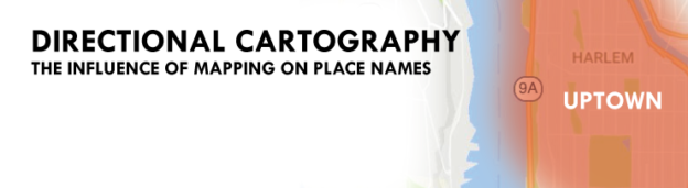
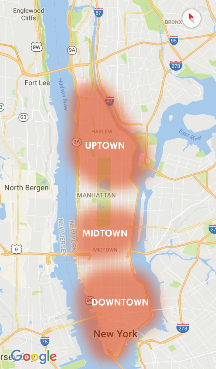
Modern cartographic standard almost always places north at the top of the page. This is not universally true, historic Middle Eastern maps placed east at the top, and cartographers aiming to combat a history of northern imperialism have ‘flipped’ the world map upside down since the 1930s. Considered though, to what effect has cartographic choice on relative directionality had on the establishment of local direction-centric lexicon? Where are local uses of relative direction (ie up or down) based on cartography, versus a geographic reason or topographic change? Looking around for examples, New York City actually covers both bases. Uptown in Manhattan is not only at the top of the map, its also ‘up the Hudson’, and downtown is at the bottom of the map.

Maps construct reality as much as they are shaped by it. Over time, many regional lexicons have developed simply based on map orientation. For example, in the Upper Midwest, going “up north” means a getaway to the wilderness in the north. Looking ‘down south’, the ‘deep south’ might be considered deep only because it is so far from the top. One travels “over east” when traveling from the interior to the country to East Coast. Globes almost always place the north pole at the top, which is in theory, arbitrary, and most view the world through the distorted parlance of Mercator. Map orientation shapes our sense of the world and the places around us.

Where are uses of relative direction are actually based on cartography?

Which local references to direction (up or down) were actually created in relative reference to mapping and cartography, as opposed to geographic reason or topographic change? The answer is qualitative, fuzzy, and everywhere. The terms up and down can be held relative to gravity, but holding them reference to a scaled representation of earth actually doesn’t make much sense. Unless you are referring to up and down in relation to topography, or relative to a certain location (ie upstream refers to water coming from a higher elevation), up and down are meaningless terms unless the common representation of the place is in a certain spot on the map. Perhaps the most egregious misuse of these relative directions is the land ‘Down Under’, Australia, given this name due to is location at the bottom of the globe.

Map Orientation affects Perception and Recognition of Space

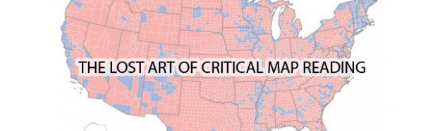
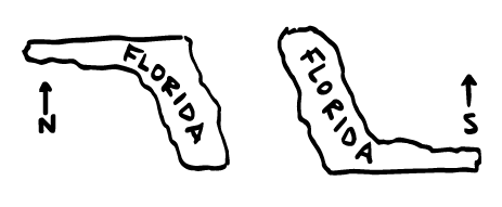
Say you were to ask a friend to draw the United States. What are the chances they put Florida at the top? Chances are, if Florida is at the top, they would simply say the map is wrong. Technically though, the map isn’t wrong at all… its just, different. It represents the same locations.

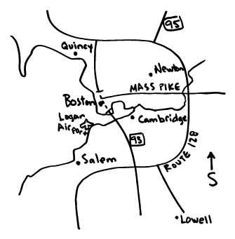
Map readers construct cognitive maps based on gained or learned geographic knowledge of the areas in which they live and operate. Mental maps of the United States almost always have the northern tier of states at the top. The maps are built around coastlines, major highways, and key points of interest. For example, look at the Greater Boston. Most have a vivid mental picture defined by shorelines and freeways. Route 128 circling the city to the left, downtown jutting out to the northeast in the center, and the harbor islands and beaches dominating the right side of the map.

Some cities flipped in a direction where north is not the top become immediately foreign, even though the map depicts the the exact same accuracy and resolution as any map with north at the top. Flipping south to the top challenges our mental image of the place and changes the paradigm in which we have built our internal navigation and recognition models. When this construction changes, a well known area can look like an entirely foreign location.

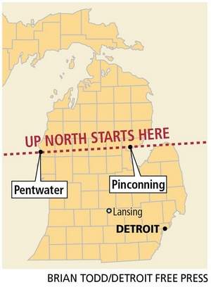
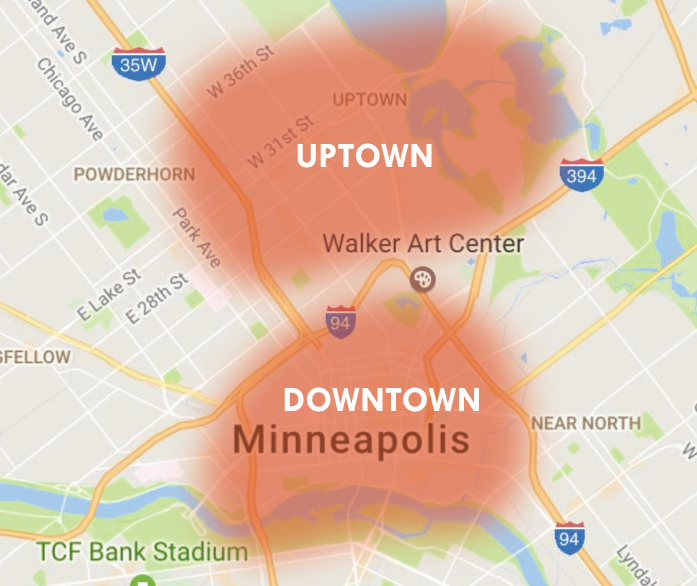
Digging around a bit, you find evidence of relative directionality all over the map, each begging a story that narrates why these places have been given these names. Take Uptown, a well known neighborhood in Minneapolis. Cartographically, why is ‘Uptown’ located below ‘Downtown’?

The roots can be found in the historical development of the city. Uptown, in this circumstance, is up and away from the Mississippi River. Many historical maps of Minneapolis use the Mississippi as a geographic foundation for the map, and anything moved away from the river is also ‘up’ the map.

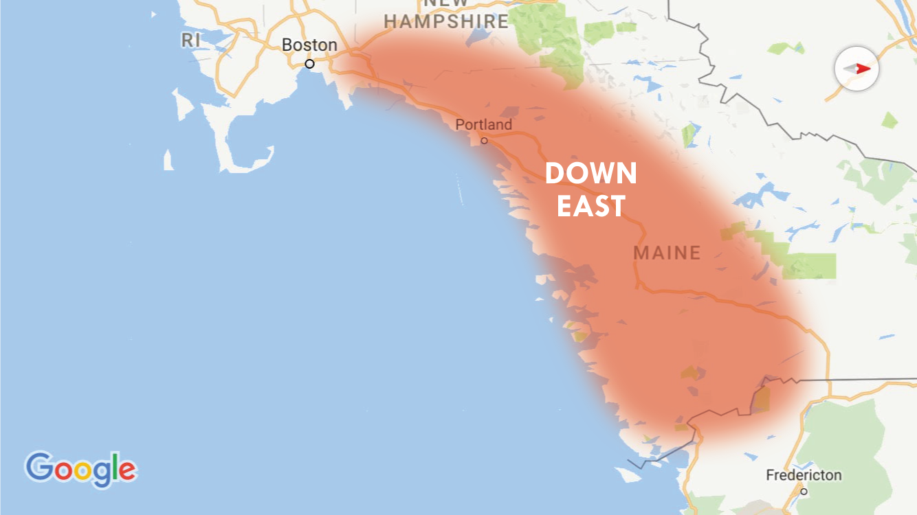
New England is a curious example. Traveling ‘downeast’ in New England actually takes you north! This was not based on map orientation, but rather on prevailing winds traveling from southwest to northeast. Historically, sailing ships going to the east would be sailing downwind from the settlements around the greater Boston area to get Maine and other points further north.

Cartographic decisions produce identity as much as they represent it, and locally relevant directional cognition has developed based on a cartographers decisions on what to put at the top of the map. It’s very simple to change map orientation, but over time, it can become foundational to a readers perception of space and how they perceive the world around them. Entire regions of our country, in part, can be traced to cartographic origins. Depicting those regions in any other way is technically accurate, and provides insight into how the people of the area have built their mental images of space into their greater culture.

This is a small sample, but there are many different locations around the world where position on the map has provided identity of place. There are probably some in your city, and you can probably find them on the map.

Why don’t we go “Up South”? Because somewhere a cartographer decided to put north at the top of the map. 

Urban Patterns: The Cloverleafs of MSP

US 169/212/Hwy 62 - Minnetonka/Edina/Eden Prairie, MN

US 169/212/Hwy 62 – Minnetonka/Edina/Eden Prairie, MN

Like many cartographers, I’ve always had a certain fascination with urban form and geographic patterns. Out of seeming chaos, patterns and systems are found, governed by common practice, understood convention, and cultural norms. Urban patterns can be found on both micro and macro scales, from a grid of streets to a facade of windows. While perusing maps and working on another project, I noticed a ubiquitous feature in the urban landscape, the cloverleaf interchange. Inspired by some beautiful recent work by Cedric Francois (Interchange Choreography) and incredibly interesting work in identification of urban patterns through image processing of aerial photography by Terrapattern, I dug in a bit more.

The cloverleaf is a bit of a relic in transportation planning. They flow freely with lower traffic, but as the facility nears capacity, the required lane weave can cause significant backups and delays. Traffic traveling through the ramps has to be limited in speed to prevent rollovers, and they consume more space than many intersections that incorporate flyover ramps. That said, they remain cost effective solutions in many regions.

I-94/US-212 - Eden Prairie, MN

I-94/US-212 – Eden Prairie, MN

While not distinctly Minnesotan, transportation planners in the Twin Cities of Minneapolis and St. Paul have been particularly fond of the cloverleaf. Perhaps its the frugal, modest Upper Midwest ethos, or simply the fact that many of these interchanges were designed in the 1960s and 70s, but if you count them, there are 31 cloverleaf interchanges in the greater Twin Cities metropolitan region. This number doesn’t include interchanges formerly arranged as cloverleafs, but at some point converted to another design. There are at least a handful of these scattered around the city, some of which more disguised than others.

1991 (left) to 2016 (right) - Former Cloverleaf - Hwys 7/100, St. Louis Park, MN

1991 (left) to 2016 (right) – Former Cloverleaf – Hwys 7/100, St. Louis Park, MN

All considered, the cloverleaf interchanges from above can be strikingly beautiful. The patterns of them are not revealed to the driver on the ground, but only from the sky. Grabbing data from OpenStreetMap, I mapped the linework of all interchanges in and around the Twin Cities metro that could be considered at least a three-leaf clover, if not a four-leaf clover. The interchanges range from symmetrical to sweeping, simple to incredibly complex. A few follow, see the poster at the bottom for a snapshot of all of them.

TH-610 and US-169

I-694 and I-35W

I-494/TH-7

I-94/694/Hwy 100 - Brooklyn Center, MN

I-94/694/TH-100 – Brooklyn Center, MN

Hwys 13/77 - Eagan, MN

TH-13/77 – Eagan, MN

I-494/35E - Eagan/Mendota Heights, MN

I-494/35E – Eagan/Mendota Heights, MN

Hwy 5/55 - Fort Snelling, MN

TH-5/55 – Fort Snelling, MN

I-494/Hwy 77 - Bloomington/Richfield, MN

I-494/TH-77 – Bloomington/Richfield, MN

View the Poster

Happy Mapping!
-Mike

The Baseball Map: Who’s in town today?

Mapping Out the 2016 Baseball Season

Visually tracking your team, and who and when they are playing, during a 180 day pennant marathon can be tricky… team schedules tend to be decentralized, tabular, and kind of boring. The aim of this map is to provide a visual schedule of the season, giving easy access to where each game in the MLB is being played by each team on each day. Follow the boys of summer through the long, grueling season, and easily find if you can grab a beer, a hot dog, and a ticket to catch your team any day. Enter the city you’re in and the team you want to follow to visualize their location and opponent on that day. Hit play and watch them travel!

Screen Shot 2016-04-03 at 11.14.29 PM

There is, of course, one team playing in the “Great White North”… be careful, your team might fall of the map when visiting.

Screen Shot 2016-04-03 at 11.21.28 PM

Play the map to get a visual of each day.

Screen Shot 2016-04-03 at 11.22.07 PM

The cartographic baseball schedule is created using D3, the 2016 MLB Schedule, some fantastic ballpark geographies from James Fee, and the SportsRadarUS API.

Happy Opening Day!

Go to the map!

Mapping Twin Cities Neighborhoods

Drawing a map of the city based on how we live in the city

What makes a neighborhood? Many things may come to mind… including the people you live with, the places you frequent, and the locations you call home. Neighborhoods are the physical locations in which people connect with the city in which they live. They are dynamic and changing, yet static, they are unique and individual, yet universal. They are the living rooms of the city, where residents live, work, and play. Neighborhoods become part of your identity.

A collection of local hubs – Between Minneapolis and St. Paul, there are over 100 unique and distinctive neighborhoods, and more if you start to count the surrounding suburbs. Officially, Minneapolis has 81 neighborhoods, 72 of which are represented by organizations operated by the residents and businesses that live and operate within their boundaries. St. Paul has 15. St. Louis Park has 27. Edina has 45!

The city is a sum of its neighborhoods, both the official ones and unofficial ones, and each is defined by the people who live, work, and play in them.

What are the Neighborhoods of the Twin Cities?

Help make the most accurate map of Minneapolis and St. Paul yet.

You draw the neighborhood.

You draw the neighborhood.

This project creates a crowd-sourced map of the Twin Cities Metro Area representing the city through the eyes of the people. In the application, no neighborhood names or boundaries are here to start with. You make the map. Real or imagined, within a city, or crossing municipal borders. Names, extents, and descriptions are up to you. After mapping, be sure to View Maps to see other people’s contributions.

North Loop Neighborhood - Minneapolis

North Loop Neighborhood – Minneapolis

Draw your City

Visit the Application. Map your neighborhood, Twin Cities!


The Technology Behind

“Map your neighborhood, Twin Cities!” is built using LeafletJS and CartoDB. This project is coded on top of projects in Portland by Nick Martinelli (Thanks Nick!) and Boston by Bostonography (Thank you, Andy Woodruff and Tim Wallace).


Visit the Application. Map your neighborhood, Twin Cities!

Nine Habits of Effective Designers

“It is not about how much information there is, but rather how effectively it is arranged.”
-Edward Tufte

It’s only appropriate to start a post on design with an Edward Tufte quote, I suppose. That said, I often find this quote very appropriate when faced with a challenging design task. It can be easy to blame design problems on your data, and indeed, data can be difficult. Facing a challenge, one of the first things the designer should ask is ‘how can I rearrange this and still tell my story?’ How you approach the design can go a very long way in creating a composition that is legible and effective and at the same time beautiful and professional.

The goal of the following is to present a simple set of goals for the novice designer that can help you rethink your design. Here are nine ‘habits’ of an effective designer, in no order of importance, accompanied by some easy guidelines and fun examples.

Nine Habits of Effective Designers


1. Less is always more.

  • When in doubt, keep it simple.
  • The effective use of negative space is a hallmark of good design – design the negative space just as you would the positive space. Ask yourself: “What elements can I remove or simplify and still retain my message?” Pare it down to the essentials.
  • For repetitive information, remember the “rule of small multiples”.
  • Remove noise. If it doesn’t need to be there, don’t include it.
beards

Source: Boston Red Sox, MLB.com


2. Be hierarchical.

  • Communicate the relative importance of data through variations in size, weight, and intensity.
  • You should be able to squint and clearly understand a simple hierarchy of your composition.
  • Establish a clear visual hierarchy based on the relative importance of elements around the graphic.

band-poster


3. Good design has C.R.A.P.

  • It’s okay if you have a lot to fit.
    • Contrast
    • Repetition
    • Alignment
    • Proximity
  • Use these principles to allow your audience to easily follow the connection between your ideas and the various elements of your graphic composition.
crap

Source: paper-leaf.com


4. Just two fonts.

  • Good design can be achieved with just one or two fonts.
  • The most useful fonts have many weights to choose from.
  • Choose one serif font, and one sans serif font.
  • Encode your graphic messages into your font.
  • Look no further than the Webster dictionary:
dictionary

Source: Oxford English Dictionary

If you are looking for some fonts to get you started…

fonts


5. Magic number 12.

  • The human mind looks for natural proportions of 2, 3, and 4.
  • As the least common denominator, 12 can be an extremely useful number for column layout, and it’s a good point size multiple for fonts.
  • Rule of thumb for prose and text blocks, text should be no more than 60 characters wide.
    • Print graphics: use no smaller than 6 point
    • Screen-based graphics: use no smaller than 10 point

nytimes


6. Imitate.

  • Beg, borrow – but don’t steal – ideas for beautiful logos, graphics, and graphics from experienced and respected designers.
  • One of the best ways to learn. Over time you will see what you like, and your own style will emerge.

volano

annemarie

Source: Annemarie Gray


7. Be color conscious.

  • Like a well-written paragraph, each graphic should have a singular message. Use color in a consistent manner to create a coherent and complete message for your graphic composition.
  • Use color and contrast to highlight differences.
  • Color often helps form the first impression of your design composition, and sometimes the first impression is the lasting impression.
  • Color encodes implied meaning and bias. Be aware of the unintentional meanings.
Grid Poster

Source: Christopher Rhie


8. Don’t go off the grid.

  • Effective graphics follow strict principles of alignment, justification, and position.
  • Layout matters: grid your design for a clean and professional finish.
  • Create a template that you can use and refer to moving forward.
  • Visual center of the page is slightly higher than the geometric center.

grid-poster-template


9. Design at size.

  • Layout your graphics at the proper size before you proceed with your creation process.
  • Scaling graphics can be tempting when working with design software.
  • Goal: Never scale your graphics up or down.
  • If you have to scale, scale down, lest you end up with the following…

pixelated


Effective design can be lasting and powerful

Habits are established over time, over time, you will develop your own. In the end, practice makes perfect.

Russian Campaign of 1812, Charles Joseph Minard

Russian Campaign of 1812, Charles Joseph Minard

Graphics tell stories, and good stories can be engaging, informative, beautiful, and timeless.


Special acknowledgement to Annemarie Gray and Christopher Rhie, whose combined design brilliance helped develop and inspire these habits.

Geography for the Non-Geographer

Geography, the science and study, is wide reaching, cross-cutting, and diverse. Spatial concepts, geographic fundamentals, analytical methods, and data maps are helpful or even critical in many disparate fields, see applications in Urban and Regional Planning, Environmental Studies, Public Health, Geology, Architecture, Journalism, and Civil Engineering.

As fields of study, Human and Physical Geography, Cartography, and GIS, are populated not only with professionals and academics, but also many enthusiasts and fanatics. The nature of spatial thought, geographic problem solving, and all of the related technologies attract a distinctive set of individuals both by trade and hobby that make for a unique and strong community, but must be careful of insularity and isolation from the industries and sciences that could it could benefit most. Interaction with the non-enthusiast is important. Geographers should be proactive and inventive, applying technology to existing methods, devising new problem solving techniques, and viewing applications in other fields as opportunity, not threat.

The focus of Geographic science, theory, and method should not be isolated, but rather seek to determine how geography can actively complement other sciences and industries, something the field is inherently tuned for. This necessitates introspection and a careful look at the field is presented to the non-fanatics, non-enthusiasts, and outside experts.

A Field of Specialized Generalists

The pervasiveness of geographic methods and the applicability of the spatial sciences in so many different fields might suggest that most outside geography view the field as a utilitarian driven enterprise, one wrapped up in a handful of software companies. The view is vastly different than that of a trained geographer, or even the so-called enthusiast or hobbyist. The science and tools of Geography are a piece of the problem solving equation, just like math and physics, but the exact tools and means of use are less prescribed.

Geographic method is often necessitated through questioning and as a means to an end. For example, what can be done to reduce poverty in my city? How can we affect policy to reduce greenhouse gas emissions? Where should I relocate my business? Or, how can I improve the life expectancy of the people in my community? These questions are inherently spatial, but often the questions are conceived by specialists in unrelated fields seeking solutions to problems. In depth knowledge of the specific problem itself is often required, in addition to spatial knowledge.

Data Analyst + Writer + Graphic Designer + Database Administrator + Front-End Programmer + Server-Side Developer + UIUX Expert + Subject Specialist + Statistician = Modern Cartographer

Geographers serve to bring their expertise to a wide array of problems and issues and are conditioned to look at the world through a different lens, one that is focused on spatial methods, tools, laws, and algorithms. Ultimately, the preceding has made Geography a field of generalists solving problems in a world of specialists. For example, modern cartographers, trained in spatial thought and design, are asked not only to be aware of geographic methods and cartographic principles, but also serve as writers, graphic designers, data analysts, statisticians, database administrators, front-end programmers, server-side developers, and UIUX experts in communicating spatial content and answers to the non-geographer.

This leads to important questions. How do we, as a field, guide Geography and communicate the importance of Geographic thought and process in larger organizations? Where do specialized generalists fit into these organizations? In what areas can expertise be shared, and what areas do Geographers own? How can we build a knowledgebase that serves to educate non-geographers on methods, tools, and concepts associated with spatial problem solving? Answering these questions is critical to the mission of a field so pervasive and universal, and crucial in spreading understanding of geographic thought. To the world:

Knowledge of geographic fundamentals leads to better data, better analysis, and better decisions.

Sharing the Geographic Knowledgebase

Spatial scientists are tasked with advancing the field and also tasked with distilling the field into components that can be utilized to allow non-geographers to intelligently answer questions using the concepts and principles of space. This is an important and challenging task. There are many methods to do this. The point is to erase a history of complacency and fear of technology by owning the field and actively declaring expertise. When it comes to sharing knowledge, distilling information and components for non-Geographers is important. Demand is there, see the proliferation of online Map Schools, Map Academies, and community-driven Mapping meetups.

Perhaps a modular approach in teaching non-Geographers is best, but one that can only be designed and run by trained geographers, educators, and field experts well versed in geographic theory and history, keeping a focus on concepts that are manifesting through the tools, and communicating and conveying the small pieces of a larger field that apply to the specific task at hand. The science of geography just so happens to be a fantastic complement to an incredible number of other sciences, especially in the modern context, this should be something leaders in the field own, rather than shy away from, and work to build strong bonds across industries. A modular approach should be viewed critically, welcomed as a way to move faster than bureacracy and red tape will allow, but cautiously aware of oversimplifying the field. Meetups should not replace advanced theory, development of tools, and critical thought.

That said, an urban planner will not care about learning spatial analysis techniques with the goal of becoming a GIS Specialist, nor will they want to learn Python with the end goal of becoming a computer programmer, but rather care to learn Python and spatial analsis methods as a means to find answers and get results. The specifics might not matter, but knowledge of the concepts and tools in a practical and applicable manner are important. Parts of geographic thought and geographic technology are relevant to various fields, and getting this message to those fields is important. Non-geographers don’t need to get caught in the weeds, but need to know that the focus is approach, and there is no one answer to their problem.

“By making it easier, our clients think it is easier. It is not.”
Michael Batty

A New Marketing Department

As a field, geography is wide and diverse. You hear the terms neo-, paleo-, and even hipster thrown around regularly, sometimes with little unity. The field needs stop deciding between concepts and tools, and declare what it is: a cross-cutting, universal base of knowledge that needs sustained exploration and development originating from technological, scientific, and critical paradigms. Whatever the identify of Geography ends up manifesting as, it needs be unified and concrete, one that can be used to not unite practitioners and professionals and also serve to build a better picture of what is required to build, develop, and implement geospatial solutions and answers in a modern location-driven society.

The tool vs. concept debate misses the point, geography is both.

Geography and GIS shouldn’t be viewed as an exclusive group for those only with proper training or enough money to pay for an expensive software license. (This hasn’t treated us very well in the past…) Software is only a part of the picture, just as fundamentals and concepts are only a part of the picture. The ability to communicate this to non-geographers and non-enthusiasts is one of the most important pieces of the puzzle for the geographic sciences to address.

The debate surrounding the Geography and GIS is not tool vs. concept, the field is both. The debate is more on the best ways to build a robust knowledgebase and tool infrastructure for the future. Research is need on best solutions for automated data management, and topics such as automated generalization, projection, and spatial analytics such as correlation and hot spot analysis. The mission should be to continue building the core of geography, developing new techniques and methods to address spatial problems, and then manifest these techniques and methods through new tools that make it accessible to non-geographers. The field of Geography should proudly stand as a field of specialized generalists, or generalized specialists, and unite to solve problems in a world that is increasingly dependent on location and spatial thought.

The Place of Process: Tools and Importance of Procedure

One of the most important characteristics one can possess in the current professional landscape is the ability to learn new tools quickly. This rings true across many industries, and is especially relevant in the spatial field, where the advancement of cartographic tools and web-based techniques for spatial data visualization, data collection, analysis, and public distribution change rapidly. While learning tools is of high importance, in the end a tool is only as powerful as its user. You can learn tools and use them properly, you can learn software and use it properly, and you can program, and program properly, but you can’t underestimate the importance of conceptual and fundamental understanding beyond the tools.

We’ve all seen this, and we’ve all been here…

owl

When you provide someone a pen and ask them to draw an owl, technically speaking, the individual will have all he or she needs to complete the task. But can the individual draw the owl? Does he or she have the knowledge, both creative and procedural, required to actually draw the owl?

Talking about Process…

Tools are tangible. Tangible is easy… well, easy enough. We can see tools, touch them, turn them on, etc. Creative and procedural process, however, can be intangible. Most well designed tools embed the fundamentals and concepts in their execution, but if you do not know the concepts and fundamentals that sit behind the tools, it can be very hard to figure out what procedural knowledge accompanies that tool, or even where the procedures, concepts, and fundamentals are manifested in the tool. Process is important! When it comes to process, having the ability to employ concepts and fundamentals while at the same time questioning implementation is highly important in effectively employing a tool.

Process provides a connection between the tools and concepts,
and is perhaps more appropriate to consider than the simple concepts versus tools debate that usually surfaces in the field.

Online, “pens” abound. In theory, there has never been a shortage of “pens”. For the innovative and creative, almost anything can be considered a pen, but the general accessibility of these pens has never been greater. Accessibility allows for choices, and also allows for the masses, including those who might lack procedural knowledge and concepts. In effect, camps form: those that know the concepts, but not the tools; those that know the tools, but not the concepts; those that know both; and those that know neither. Where you fall is likely inconsistent, depending on the task at hand, but the awareness of your place on the spectrum is important in building concrete knowledge and effective proficiency. When given a pen and starting to draw, the path to proficiency is a windy one, learning from those around you, determining if there is a better pen, and drawing an amazing owl.

process_vs_tool

There is no shortage of methods and means that introduce pens, but what to do beyond simply hold the pen and scribble some circles becomes a mix of professional experience, educational background, and, perhaps most importantly, sheer will. Introductory tutorials are invaluable, and I firmly believe you can’t have too many, but at some point, the tangible tools blend into intangible skills.

We’ve all taken courses where you are given a pen, but how many courses have you taken that show you what to draw with the pen?

In my experience, the most valuable courses, highest quality workshops, and most effective teachers are able to locate that point where the tangible becomes intangible. They will attempt to drop you there and push you along, challenging you to wield your pen with confidence, to draw as many owls as you want, and ultimately question the pen. We’ve all taken courses where you are given a pen, but how many courses have you taken that show you what to draw with the pen?

The introduction of fundamentals and concepts is equally important as the introduction of tools one can use to implement them. Learning how to properly use a tool and effectively and efficiently produce a fine deliverable from that tool is a multi-step, multi-faceted process. One leads to the other. Both can be taught, it just depends what angle you want to take. Ultimately, the point is that process, be it creative, procedural, or developmental matters. Concepts and fundamentals are important, no matter the tool you have in hand, and knowledge of process allows for the challenging of tools to improve. There will never be an ‘easy’ button that does everything. In actuality, we don’t want that.

Tools, aka our “pens”, provide a portion of the capability. You, the wielder of the tool, provide the rest.

pen

The Lost Art of Critical Map Reading

In a world of budding novice mapmakers and shares, likes, and retweets, we have never seen maps and graphics appear, circulate, and educate as much as they do right now. Maps are an engaging way to visualize data and gain knowledge.  Geovisualization, cartography, and analysis are not only relevant, but highly visible to the mainstream, and it is great for the field. The New York Times and Washington Post, among many, lead the way with excellent, high quality, and reputable maps and graphics. We’ve all seen the forty maps that change your view of the world.

There is another side to this though, that of the mapmaker, specialist, or blogger that catches or creates a map, and in a whim of ‘This is cool!’ and with knowledge that they have a listening audience, relays the map into the internet universe. Little regard is sometimes taken in the validity or interpretation of the map and its data, or how it should be framed to the greater public. ‘Bad maps’, they could be called, are not new, but they now exist on an widely accessible mainstream level, and are fueled by Twitter retweets and Facebook shares.

least favorite

Obviously. (via Business Insider)

The ‘bad maps’ exist in multiple forms, starting with those that could be considered ugly (or graphically undesireable); those that might mislead readers; and then those that are just plain wrong. Maps that are simply ugly are not ‘bad maps’, per se. They communicate a message, convey a story, and serve to educate many. The quest to identify and improve these maps or even defend these maps, is emerging. Many talented and experienced cartographers and designers have initiated some great discussion on the topic, and poked plenty of fun at the issue. Virality of maps has become an important topic. Awareness of the issues will only improve cartography and data visualization in the long run.

That said, more troubling are the latter maps that are wrong or misleading, yet still gain the aforementioned viral steam and exposure. This discussion exposes a greater, more concerning problem that needs to be discussed – a pervasive lack of critical map reading skills.

Critical map reading takes the greater pedagogy of critical reading and applies it to maps and visual graphics. It is a form of map reading that does not take a map at face value, but instead examines the data, authors, sources, presentation, and prose of a map, investigating the claims those components assert. Maps are a unique medium in which every part of the composition is data. Given their inherent ability to relate specific topics to the earth we live on, maps are often viewed as truth and fact, and are rarely challenged. However, at the same time maps are storytellers, providing rich illustrations and the ability for interpretation. Cartographers mix these ingredients in a powerful and compelling manner, and many in the general public are largely blind to the concept that maps and visual graphics can be disputed.

Part of the allure of a map is that it encourages the ability to interpret and explore. All maps contain a message, the practice of map reading is discerning and resolving that message. It is the questions that now become important. What makes this map “the most accurate”? Why is this map “incredible”? What methods where used on the data shown? Is a map the best way to show this data?

The route to critical map reading might not be clear, but awareness is perhaps the best place to start. Here are five simple habits that will improve map reading abilities.

Read all textual components and prose on the map carefully

Maps use both visual and textual communication methods. Even the most well designed map is nothing without context. Textual communication assists the reader in better understanding and interpreting the product. This content includes source information, titles, authors and affiliated organizations, and cartographic prose. Critical reading of this information will inform on how to properly intepret the product and relay it to others. Martin Elmer writes a well done piece on map prose here.

The-True-Size-of-Africa

Note the ‘Please Note’. It will probably have a note that helps you understand the map. Or what the map isn’t.

Learn as much as possible about the data being shown on the map

Know the limitations of your data, and the constraints of the it’s graphical representation. Ask about the methods that acquired the data, and whether or not it has been summarized or simplifed in some form before being displayed. Data sources and original links can usually around the fringe of the map. Focus here on collection methods and manipulation tactics. Determine for yourself whether or not these are the best data sources to show the information, or whether or not the methods used are appropriate. Ask yourself, is the data qualitative or quantitative? Categorical or nominal?

buzzfeed_favorite_band

This is not showing every state’s favorite band. The data and sources will expose this. (via MusicMachinery.com, Buzzfeed.com)

Note that everything on a map can be considered data

Falling close in line next, maps are unique in that not only the subject matter is data, the entire presentation can be considered data. A basemap of the United States is just as much ‘data’ as the points and colors scattered across it, along with the areal enumeration units. Sample case, some counties in California are the size of Massachusetts, yet national maps distilling information by county are common place. Consider how else the data could be shown, or what other options might be available.

election results

I don’t think Romney won, but it looks like he did. (via SkeptimusPrime.com)

Be aware of what the map is NOT saying

Just as everything on a map can be considered data, critical map reading involves consideration of what is not shown on the map. Ask what data could be shown in complement with the data being displayed, or what additional variables or regions could be shown to improve the output of this map. Here lies the concept of ecological fallacy, in which information about individuals is deduced from the inference for the group to which they belong. Derive for yourself the strongest statements you can make from the data presented. 

football-fandom

This might not represent ‘your’ favorite football team. This map isn’t wrong, its just also not necessarily… right. The Broncos sure are important though! (via Deadspin and CommonCensus)

Notice that graphic representation and color encode bias and implied meaning

Maps visually communiate through a handful of variables. Perhaps the most quickly interpretable is the use of color and emphasize and exclamate points. Dark, bold colors imply importance, while washed out, desaturated colors imply the opposite. The chosen colors are a conscious (or unknowing) design decision made by the map author, and strongly affects reader interpretation. Envision changing the color scheme, or categorization method, and seeing how that affects the gravity of the map.

passport-possession

So Mississippi is the best? It’s the darkest. No, wait, is having a passport good or bad? What kind of color scheme is this? (via CPgrey.com)

Getting into these habits will help distill the the true message of the map, improve ability to gain knowledge from the map, and assist in interpreting a greater meaning about yourself and your surroundings. More reading abounds on this topic, and goes into much greater depth. Notably, Mark Monmonier’s How to Lie with Maps is perhaps the proverbial work on this topic, along with great reads by Denis Wood and Jeremy Crampton. Even the best designed maps require context and a critical eye. 

In an era of information overload and retweets, critical thought of what is posted to and passes through our feeds is often overlooked. As maps and big data go mainstream, and visualizations become more prominent, educating map readers on critical interpretation becomes more important.

This is all almost as important as educating budding map makers on another thing… critical map making.

The Land of Coding: Cartography and the Embrace of Technology

Somewhere in the past few decades, cartographers have lost the control of cartography. How could this happen? Can we get it back?

This past fall, I co-taught an introductory GIS and Cartography class in a department of future urban planners. Many great questions were brought up and discussed through the duration of the course, some I would hear more than others. Two of the biggest questions were often in tandem. “Should I learn to code?” and more specifically, “what language should I learn to code in?” My answers were always, “Yes, you should!” and “Anything!” – The reasons for these answers are obvious, I suppose. Learning to program involves a paradigm shift, and you have to be taught what this shift is and should look like. Learning one language will allow you the paradigm that you need to pick up other languages more efficiently. Once you can change and establish your basic assumptions, it becomes a classic example of the law of increasing returns. A coder learning new functions is much like a linguist learning new verbs.

Perhaps the most important professional attribute one can have in our modern society is the ability to learn and pick up new technologies quickly. When learning a new technology, don’t focus on the tool itself as much as the concepts and fundamentals that manifest themselves through the tool. Same goes for coding. Many of the basics from one language to the next, or from one library to the next, will transfer, not to say you won’t have to bury yourself in syntax references for a while.

To an extremely visual person, learning to code can be a tough task. Taking yourself from the world of visually choosing colors from a palette to being more concerned about what specific hex codes are is not a very scintillating prospect, and going to a place where you generalize a map by creating an algorithm consisting of “if and for” loops quite frankly sounds super boring. One has to get to the point where it becomes a puzzle and you are using the pieces to help solve a task, do this and you will no longer see just a string of strange characters.

Much to my dismay, and unfortunately to the huge detriment of the field, geographers, and specifically cartographers, have been slow to embrace coding. I would largely attribute this to the fact that the history of cartography is very visual. The craft and science has revolved around the illustrative, visual representation of location and earth for hundreds, if not thousands of years. While fundamentally scientific, in practice cartography is an ultimate exercise in communication and design. In the 1980’s when GIS was beginning to take hold and technology started to explode, software made really (like, really) ugly maps, leaving many cartographers to write it off, think of it only as a data utility, then quickly return to familiar and well-known visual mediums for geographic representation. As such, we have lost our hold as the creators and keepers of maps. Cartographers, as such, did not embrace coding as a new tool for creating maps. This in hindsight was a monumental mistake.

Because maps and location are so prevalent in society, the field did not die, but it must now be shared with computer scientists, data programmers, and professions everywhere that may have little knowledge of the intricacies of geographic data, longstanding cartographic conventions, and proper spatial science techniques. Is this a bad thing? I don’t know, probably not. Cartography, even if it goes under the guise of “infographic” or “data visualization” has seen a renaissance in the last ten years as location-based services and spatial data management and visualization software has exploded. Some have even argued a golden age. Can we take back control? Probably not in full. Can we embrace what it has become, absolutely.

In many professions, coding is a buzzword, but to those in the spatial industry, be it geography, visualization, planning, or whatever, get yourself in the proper paradigm to carry the field into the future. The professional world and nature of mapping have changed. To survive, you must have a useful, relevant, and utility-driven work belt, and make sure that being able to create and design through the use of code is one of the tools you have in it.


Minneapolis: Then and Now

So I stumbled across an old postcard of Minneapolis, taken of the skyline probably in the mid-1960s. I was immediately struck by how close it was to a photo I took earlier this year (late March 2013, obnoxius chain link fence on the Franklin Ave bridge and all).  The growth of the city core is incredible over the last 50 years. The Foshay Tower (now incarnated as the W Hotel Minneapolis) is just about the only recognizable landmark that has endured the test of time, or in other words… survived the great and destructive Minneapolis urban renewal projects of the 60s and 70s. Also surprising is the overhead highway sign gantry at the exit to Interstate 94 Westbound, which has remained unchanged over time and through many MNDOT iterations.

Minneapolis Time Machine

Look at the complete lack of traffic! What I’d give for that these days!

Looking for other before and after skyline photos, Minneapolis or other.  Reply and share!

-Mike